
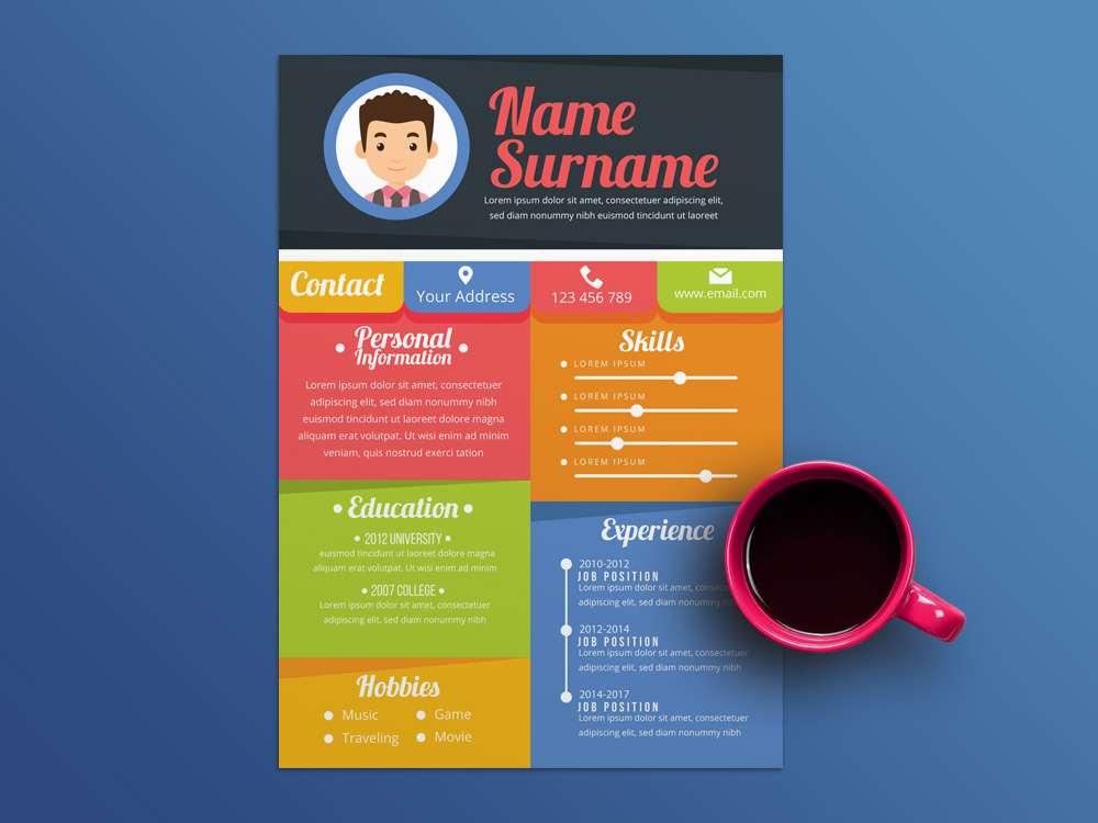
Don’t use colour on your resume – unless they’re ‘hiring you for your creativity’
When writing a resume, there are multiple expert tips to consider. Make sure to mirror the language in the job description if it’s relevant to your experience. Use impactful verbs in describing what you did in each job. Quantify your accomplishments with impressive numbers.
That’s all fairly straightforward. But when it comes to trying to make an impression, should you consider adding elements to your resume that make you stand out even more?
For instance, while the standard resume is written in black font, should you consider colours like green or purple as well?
‘Nobody really wants a creative accountant’
When it comes to a colourful font, experts agree it really depends on the industry you’re in.
“If you’re an accountant or an IT person, nobody really wants a creative accountant,” says Julie Bauke, founder and chief career strategist with The Bauke Group.
That likely goes for other industries, too, like finance and medicine. Keep it to Arial, Times New Roman or Calibri, 11-point, black font on a white or cream-coloured resume.
However, when you are in a field “that they’re hiring you for your creativity,” says Bauke, like graphic design or animation, “you’ve got more room to play with.”
If you’re in one of these fields, when you’re applying for your next position, ask yourself, are you applying for jobs in which your resume could be an extension of the artistic voice you’re trying to convey? If so, what would best help to convey it?
Keep in mind: “It’s important to consider legibility, and bright colours can be hard to read,” says Octavia Goredema, career coach and author of “Prep, Push, Pivot.”
If you’ve chosen a colour other than black, try printing out your resume to see if it’s legible before using it.
Colour ‘is not going to make any difference in your skills’
If you do add a bit of colour, just remember to keep the rest of the resume clean and stick to a traditional format.
“If you’ve got boxes here and different colours here and arrows going here, and you’re trying to be all cute, then I’m all confused,” says Bauke. “You want to make sure that it’s straightforward, that people can understand what you’ve done and what you’re looking for.”
“If you are in doubt about the design you have chosen,” says Goredema, “ask someone more senior than you within your industry, ideally someone who makes hiring decisions, to review your resume format.”
Plus, and most importantly, “a blue font or black font is not going to make any difference if your skills and expertise and accomplishments are not relevant to the role that you’re applying for,” says Goredema.
So make sure you’re including the relevant experience and impactful bullet points that prove this employer should consider hiring you regardless of purple font, squiggly underlines, or any another quirky design element.
CNBC – Gili Malinsky